For: Kent State University, UX Masters Program
Role: Student, UX Lead
When: Spring 2020
Summary
In this hypothetical scenario, PapaJohn’s has hired our design team to research the usability of their desktop ordering interface.
Skills Applied
- Screener Questionaire
- Usability Scenarios
- Usability Tasks
- Remote Interviews
- Recording Forensics
- Interview Synthesis
- Quantitative Tasks Analysis
- Executive Communitcation
Problem
In this hypothetical scenario, PapaJohn’s has contracted me to research the usability of their desktop interface. It is their belief that they are losing customers due to issues with the interface, both in ordering items and in getting support. My job was to conduct a usability audit to determine what usability issues exist on the platform and recommend follow-up research.
Methodology
The first step in conducting the usability audit was to identify screener questions that would allow me to target the right type of user. I also developed a situation & task list that would allow me to test the interaction of the interface.
Moving on, I used the screener questionnaire to exclude individuals who didn’t use computers or hadn’t ordered pizza online before. Once participants had passed the screener test, I read them each situation scenario and gave them a task to complete. I observed each participant’s progress, taking notes to supplement the recording.
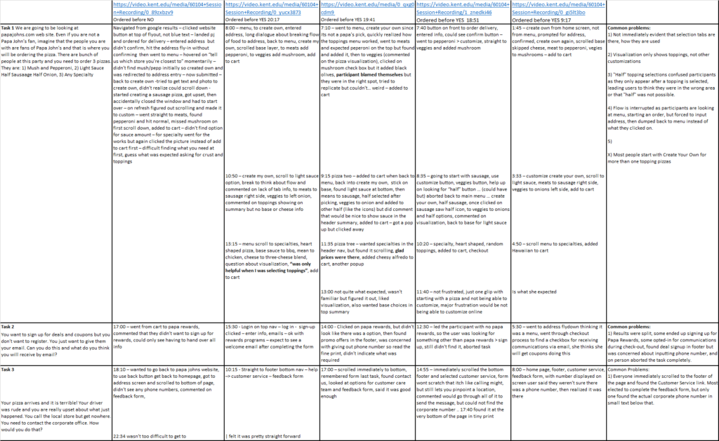
Finally, I reviewed each session’s recording and took notes on the participant’s successes and challenges. All notes were loaded into an excel spreadsheet where issues were logged and compared with the others to identify commonalities.
The project closed with a final report and recommendations for what PapaJohn’s could improve in their desktop ordering interface.
Screener and Tasks
Building a viable usability study requires the selection of target users through screener questions and creating a lusory experience that fosters as true-to-life behaviors for task completion as possible via scenarios.
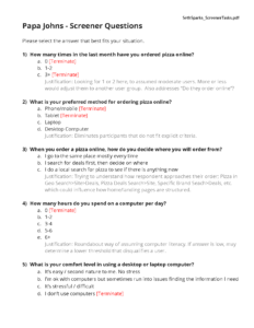
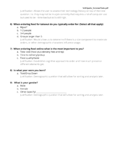
Screener Questionnaire
To ensure that the usability study provided actionable results for a targeted user, I had to exclude certain user types from the study. Specifically, I was looking for individuals that had ordered (preferably pizza) from a desktop site without being an “expert”. Behavioral and demographic questions were also asked to help me synthesize the data.
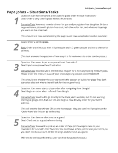
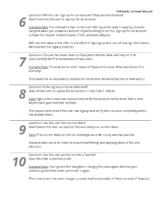
Scenario & Tasks
To get the most realistic behaviors from participants, they are given task scenarios that give context to the action we want them to perform. Adding this lusory experience is a bit like a game, where we ask them to suspend reality and step into this world for a moment.
Of the scenarios and tasks we created, only three were selected as part of the final research plan.
The Study
I conducted five individual studies from the target audience, recording each one for later review. Notes were compiled to identify common issues during the tasks and used to formulate recommendations for the client.
Research Sessions
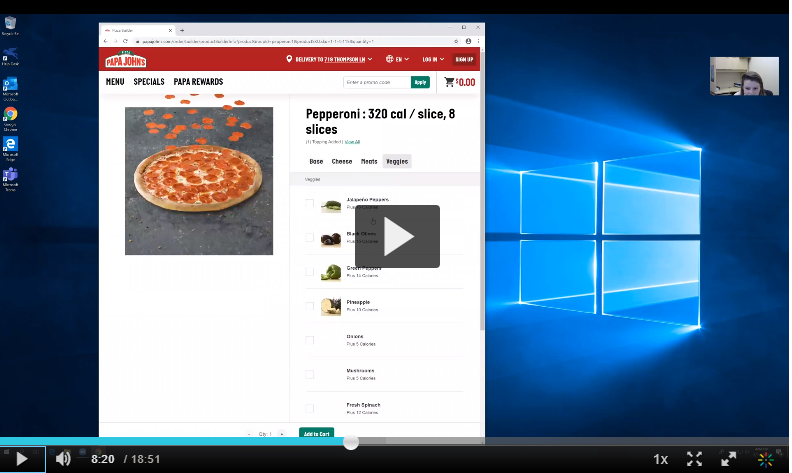
Each session began by asking the participant the standard screener questions. The participant was then asked to complete some warm-up tasks to familiarize themselves with the input devices, as well as calm any nerves that might be present. Finally, I presented users with each scenario and asked them to complete the three selected tasks.
Research Synthesis
Once all sessions were complete, I created a spreadsheet matrix with each task on the vertical axis and each participant’s session on the horizontal axis. As I reviewed each session, I added to my live notes and input the details in the corresponding cell. This allowed me to easily assess each task individually across users to find common issues that would manifest recommendations for improvement.
Findings
Tasks Analysis
Task 1 - Order Three Specific Pizzas
Stats
- Completion Rate: 100%
- Average Time to Complete: 6m
- Average Issues per Participants: 3
Summary
All users had previous experience ordering pizzas online and thus were successful in completing the tasks. They were slowed occasionally by nuances of the site like base/cheese/meat/veggie navigation, missing information from the pizza selection text, or identifying how to add a topping to half the pizza. However, these challenges were overcome. This provides us a good case for making a usable site even better.
Task 2 - Sign-Up for Coupons (Not Rewards)
Stats
- Completion Rate: 25%
- Average Time to Complete: 3m
- Average Issues per Participants: N/A
Summary
The instructions for this task seemed to confuse most of them or resulted in a false positive when users signed up for PapaRewards. While we can utilize the results from the study to assume that users are accepting of PapaRewards, it remains to be proven that customers who only want deals without a rewards account can successfully sign-up.
Task 3 - Contact the Corporate Office
Stats
- Completion Rate: 100%
- Average Time to Complete: 1m
- Average Issues per Participants: 0
Summary
Per the recommendations, even though users were satisfied with the feedback form and in one case lucky to find the phone number, making it more visible should be a top experience priority. It’s less about usability and more about being an accessible business.
Usability Findings
My findings were broken down into 5 sections based on the tasks.
Before the Pizza Order (Task 1)
- User flow was interrupted for all participants as they started to order when location selection was necessary
During the Pizza Order (Task 1)
- Most participants began with the “create your own pizza” option, even if a quicker method was available, possibly attributed to some mutation of Hick’s Law
- Participants did not immediately recognize that Base/Cheese/ Meats/Veggies selectors were tabs and struggled with navigating, making the users feel dumb
- The pizza-builder visualization and live text summary only reflect toppings and ignored changes to sauce/crust/etc., leading the user to question if the system actually captured their request
- Selecting “half” toppings were burdened by the lack of iconography, as users didn’t realize they had to select the topping itself before selecting its apportionment in a violation of Jacob’s Law as users now expect this
Signing Up for Deals (Task 2)
- Only one participant was able to complete this task due to its location vs the prominence of the Rewards program, a consequence of marketing pushing one mechanism over another
Contacting Customer Service (Task 3)
- Users were not able to find the corporate phone number but appeared satisfied with the online feedback form as long as they got a response in a timely manner
Follow-Up Research Recommendations
What is the market demand for deals and promotions?
We tested if this was findable, but if people are satisfied with PapaRewards it potentially doesn’t need to exist. If there is market demand, then it needs to be positioned accordingly.
Would a stand-alone “create my own” pizza option make sense?
Since most people start with this, could it be the default option above all others? It doesn’t logically fit within the swim lane it exists now.
When is the right time to select the location?
Breaking the flow after the user has selected the menu is illogical, but when is it appropriate to identify the location?
Does making half-topping selections visible improve the user’s task time?
We recommended making the half icons visible, but does it clutter the page too much? We should study if it will help or hinder the overall experience.
Is it more important to have selections displayed in the photo visualizations or text summary? Which should be added first?
If a choice must be made between updating the photo visualization or the text-based summary, which should be enhanced first?
Final Deliverable
The final report was delivered as a PowerPoint presentation, viewable in the PDF below.
