For: Kent State University, UX Masters Program
Role: Student, UX Lead
When: Fall 2019
Summary
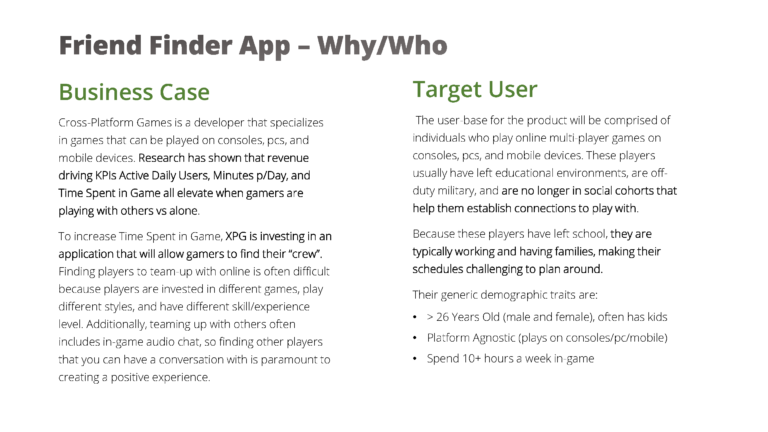
This project required us to come up with a new app idea and create a working prototype. I decided that the market needed a better way for gamers to find friends that they would enjoy playing with based on more than just the game. I set out to create something that would pair like users together for long-lasting friendships through games, reducing the animosity and toxicity that comes with pairing up with random other players. The project required up-front research, workflow diagramming, wireframing, and finally prototyping, all done iteratively making adjustments along the way.
Skills Applied
- Product Development / Design
- Secondary Research
- Business Case
- Workflows
- Wireframes
- Annotations
- Interactive Prototype
- Adobe XD
Problem
The stated problem is that there is no trusted application for finding people to play video games with that matches you based on a more detailed profile. This leads to players enjoying games less, gamers leaving certain multiplayer games, and the suffering of the gaming industry as a whole.
Methodology
Project Brief
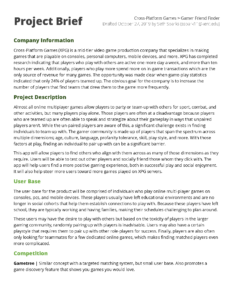
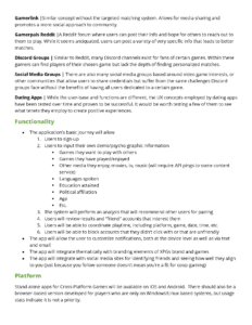
The first action taken on this project was to complete the project brief explaining the company, opportunity size, project goals, users, competitive assessment, and functionality.
While some competitive products existed at the time, few had detailed user profiles that were to be used for matching like this app. Most to this day still prefer to match users based on their game preferences, and less on their individual personality, leading to matches that don’t work out.
Screen Flow
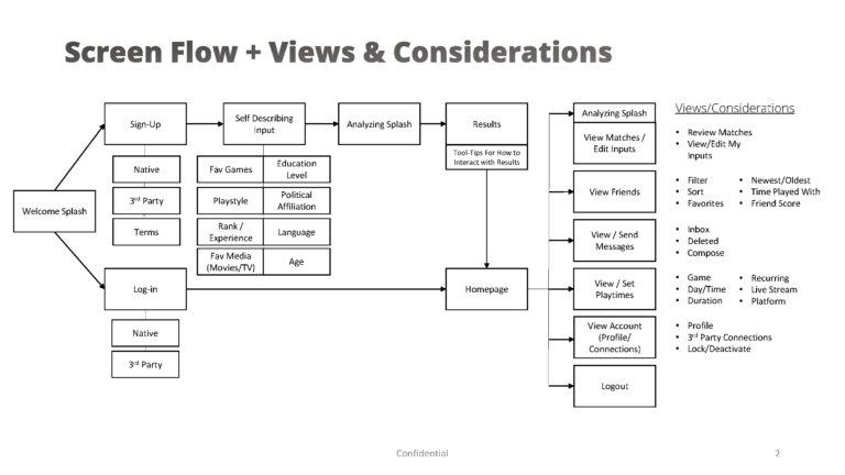
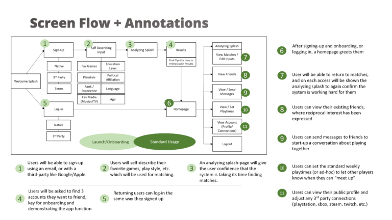
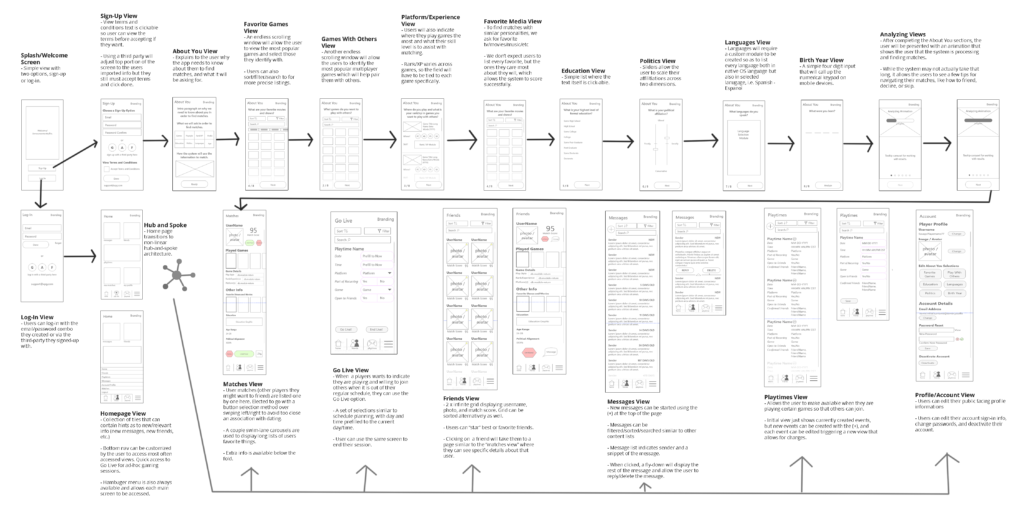
Next, the screen flow was developed. This flow shows the uncomplicated path from discovery to onboarding and beyond for users. You will see the screen flow itself in one slide, along with another version containing the detailed annotations for what each viewport’s function will be.
This was the first flow where I really felt like it made sense. By thinking through what screens needed to contain to help the user progress, it armed me with fields, displays, hints, and feedback that allows for a more positive onboarding experience.
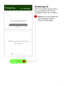
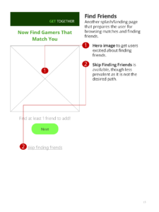
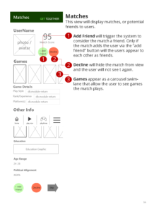
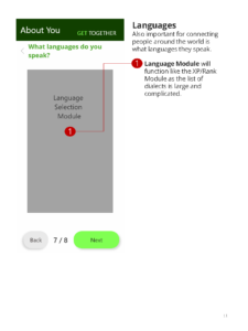
Wireframes
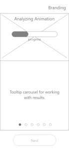
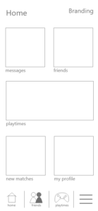
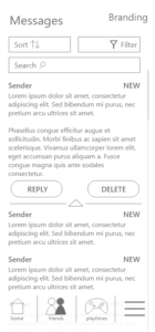
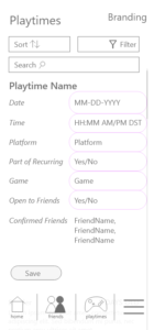
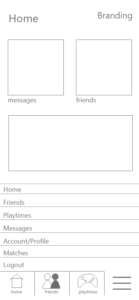
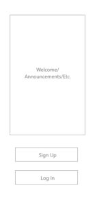
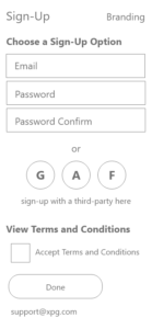
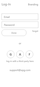
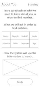
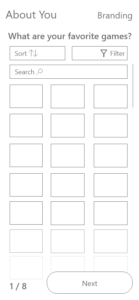
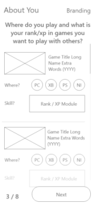
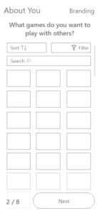
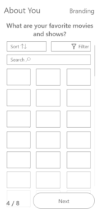
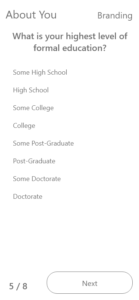
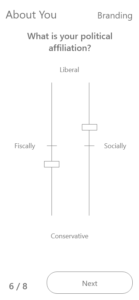
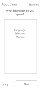
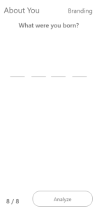
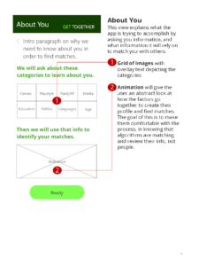
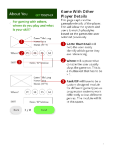
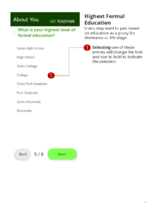
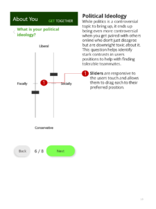
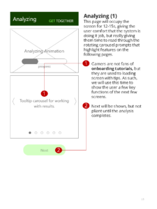
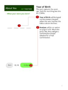
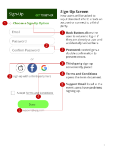
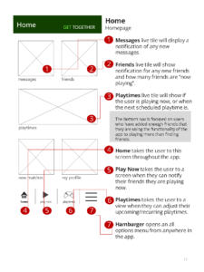
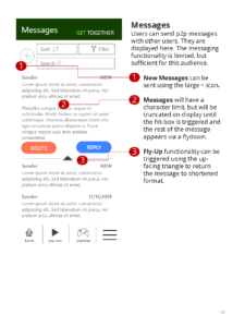
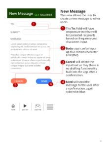
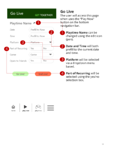
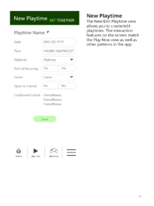
For this project, I skipped hand sketching the wireframes and went directly into Adobe XD. I knew I would be doing a lot of moving of individual components and felt it would be easier to do digitally. Starting with standard vertical orientation, I created two initial views; 1) the onboarding template with the progression actions at the bottom, and 2) the home screen template with the bottom navigation bar.
Once those two templates were created, I started building out the wireframe views according to my workflow for those portions of the app. This worked well as I could easily reuse the header and footer elements along with their coded transparency and other attributes.
I also got extremely familiar with XD’s Repeat Grid functionality.
Wireflows
Next, to put the wireframes in an order that would allow for feedback, I created this wireflow. While some people prefer to separate out the viewports so there is less on the page, I felt there were few enough screens that I could insert them all on one page. This allows for a more comprehensive view of all screens, and a more holistic understanding of the design system.
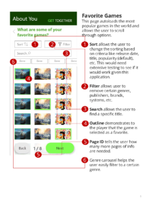
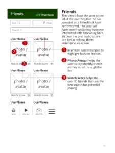
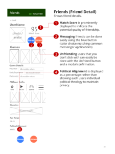
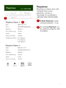
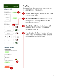
The annotations help bring functionality to life prior to the prototype for feedback, as well as indicate the expected user state when the viewports changes significantly.
Results
Final Prototype w/Annotations
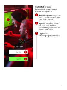
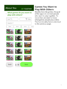
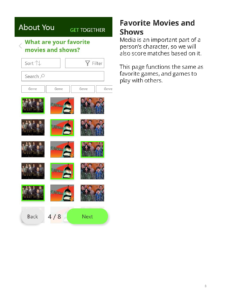
Finally, an interactive prototype was developed from the wireframes, adding real imaging, some coloration, and scrolling/input interaction. This is where the decisions around interactive features like filters, searches, selections, larger hit-boxes, and bottom navigation come to life and create the overall design.
The final prototype was completed in the Fall of 2019 and ironically now resembles a number of similar services released after its creation. You can view the interactive prototype here.
