For: Nationwide Insurance | Role: Employee, Project Lead | 2016-2019
Summary
In 2016 Nationwide’s affinity program invested in a thought leadership initiative to educate non-profit partners on how to craft a best-in-class member experience. I led the development of two major portions of this program, developing the website and managing all marketing and communications strategies. Using a variety of user research methods to help develop the program and site, as well as a number of targeted and personalized marketing tactics we developed a program that had tripled in size over its two-year lifespan.
Skills Used
- Product Development
- Marketing Strategy
- UX Design
- CMS Management
- Content Development
- Graphic Design
- User Research
- Wireframing
- Prototyping
- Usability Testing
- Community Management
- Content Planning
- Public Speaking
- Video Production
- Motivational Design
- Gamification
- Adobe CS (Pr, AE, Id, Ai)
- Mailchimp
- Google Analytics
- MS Office (W, P, E)
Business Strategy
Prior to 2020, Nationwide partnered with hundreds of non-profits to offer insurance products to their members. Using the partner’s marketing and communication channels was key to the success of each relationship, but often partners were not as savvy as Nationwide.
In an effort to help partners be more successful, which in turn would help Nationwide, a $1M project was initiated to create the Member Experience Network.
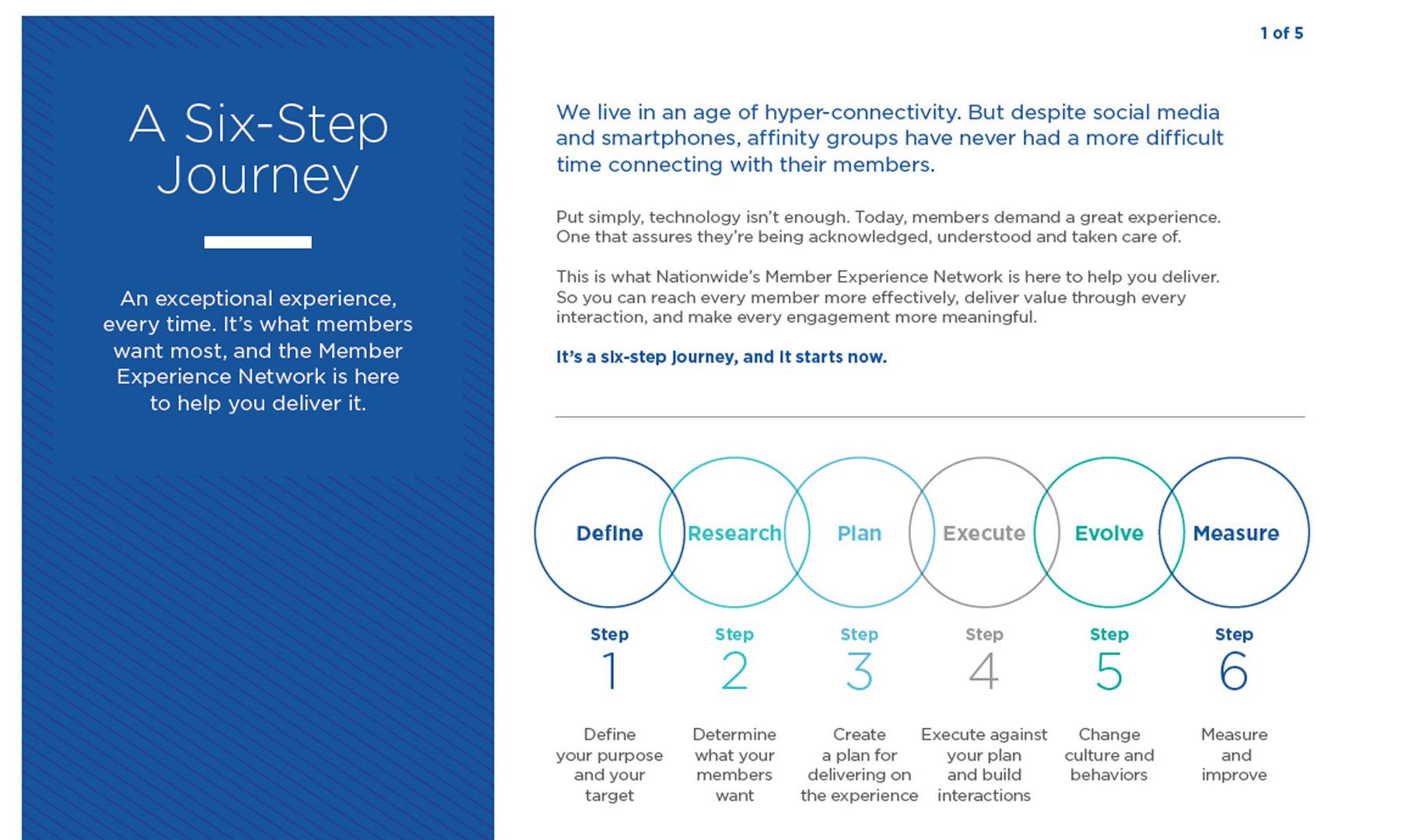
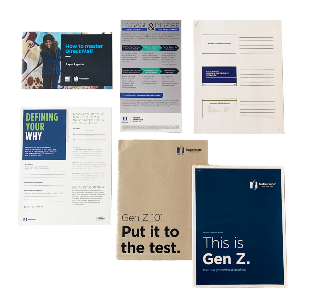
The Network, as it was usually dubbed, had an educational foundation built around helping partners enhance their members experience. We formalized the experience building educational content into a six step process, and then created topical content specific to marketing, direct mail, and social media. A team of three led the initial development, myself, Abbi Failla, and Kortnee Campbell in partnership with a third party copywriter.
I led the planning and development of the website design, as well as the marketing strategy and execution.
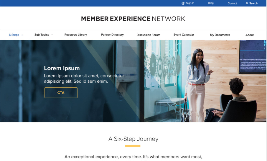
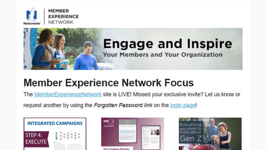
Development
Product + Website
User Research

We executed three research studies to help develop the Member Experience Network product.
1) First, we conducted a survey (via Typeform) to understand both the content and features of the site.
2) Then we held phone and in-person interviews with key user stakeholders to confirm our learnings and intended product direction.
3) Finally, we landed on a group of eight recurring contacts that became an advisory council that continued to provide critical feedback throughout the life of the program.
Our research gave us enough data to confirm the MVP feature set and begin wireframing the site.
Wireframes
Using our research combined with competitive forensics, we had a direction for our MVP. I developed an initial hand-drawn wireframes for our advisory council and developer to react to.
Our advisory council members were overwhelmingly supportive, providing additional feature requests beyond the scope of the current iteration.
The developer, Shipyard, reviewed the initial wireframes and adjusted them to fit the modules available within their proprietary CMS prior to prototyping. Those frames were shared with stakeholder areas for feedback purposes that would feed the design of the initial protoype.
Prototype
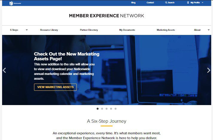
The project was developed under agile methodology allowing us to focus on fitting components into the CMS as they were developed by corresponding design and content teams.
Daily scrums allowed us to take feedback to the external dev team frequently during the initial framing of the site. Feedback would come from our advisory council, branding, legal, leaders, and other areas at their discretion so daily huddles were required to ensure we could talk through every note.
Eventually, we were comfortable with the fidelity of and feedback from our initial wireframes, so the initial site prototype was developed in a sandbox that could eventually be pushed to a live environment for Usability Testing.
Usability Testing
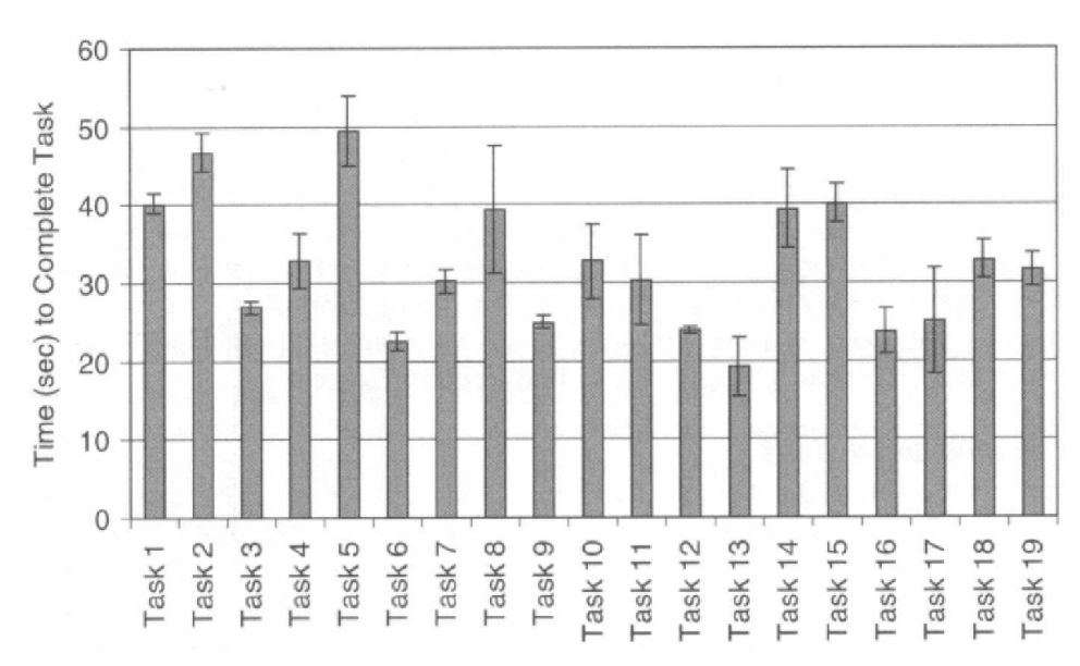
Site UAT was done by partner managers, our marketing support team, and the Nationwide UX team. Each area had disparate testing tasks related to site functionality.
First, partner managers who had not previously tested the system were asked to complete a series of onboarding tasks to confirm the launch experience was frictionless.
Second, the Nationwide UX team conducted their own usability/accessibility analysis of our platform, reviewing interaction visual design elements.
Last, a select group of partner users were allowed to access the alpha version of the platform to test critical workflows. Most of these sessions were done using video conference screen sharing so we could capture issues, hear partners feedback, and direct them if they got stuck.
Marketing & Communications
CRM / Audience
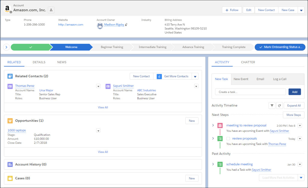
The audience for the program were both our daily contacts and other employees at our partner organizations, spanning all functions and authority.
First, we developed a set of personas that provided guardrails for developing messaging and selecting channels. For example, the higher up the individual at the organization, the more personal the communications channel that was chosen.
Second, we cross-indexed personas with other user tags that allowed content to be selectively targeted to users within different functional areas; e.g. fundraising, marketing, list management, etc.
Branding & Channel Selection

Under our 20-year-old ABM operations, we already had direct access to most of our audience through a variety of channels.
We stuck closely to the communication channels they preferred; emails, phone calls, in-person meetings, webinars, newsletters, and videos. For emails, phone calls, and meetings it was customary to provide our partner managers with scripts and templates they could use and/or personalize for each partner.
We also elected to begin a monthly newsletter, highlighting key users success stories and sharing new or underutilized content.
We also implemented a user-generated content initiative with partners, allowing them to share how they were using our material to make their members’ experiences better.
Service Launch Plan

During the program launch we had a rich and robust communications plan, both externally to partners and internally to key stakeholders. We launched the program in waves of users so that we could make each invite as personal as possible. In a typical week we would:
- Send personalized site invites to each contact at a partner organization
- Contact new users via email/phone to ask about their onboarding experience
- Field emails submitted via the contact form
- Update instructions based on feedback and issues
- Send IT issues to dev for priority fixes
- Refresh all documentation and retrain the team on changes for the next week
Persuasive Strategy & Influencers
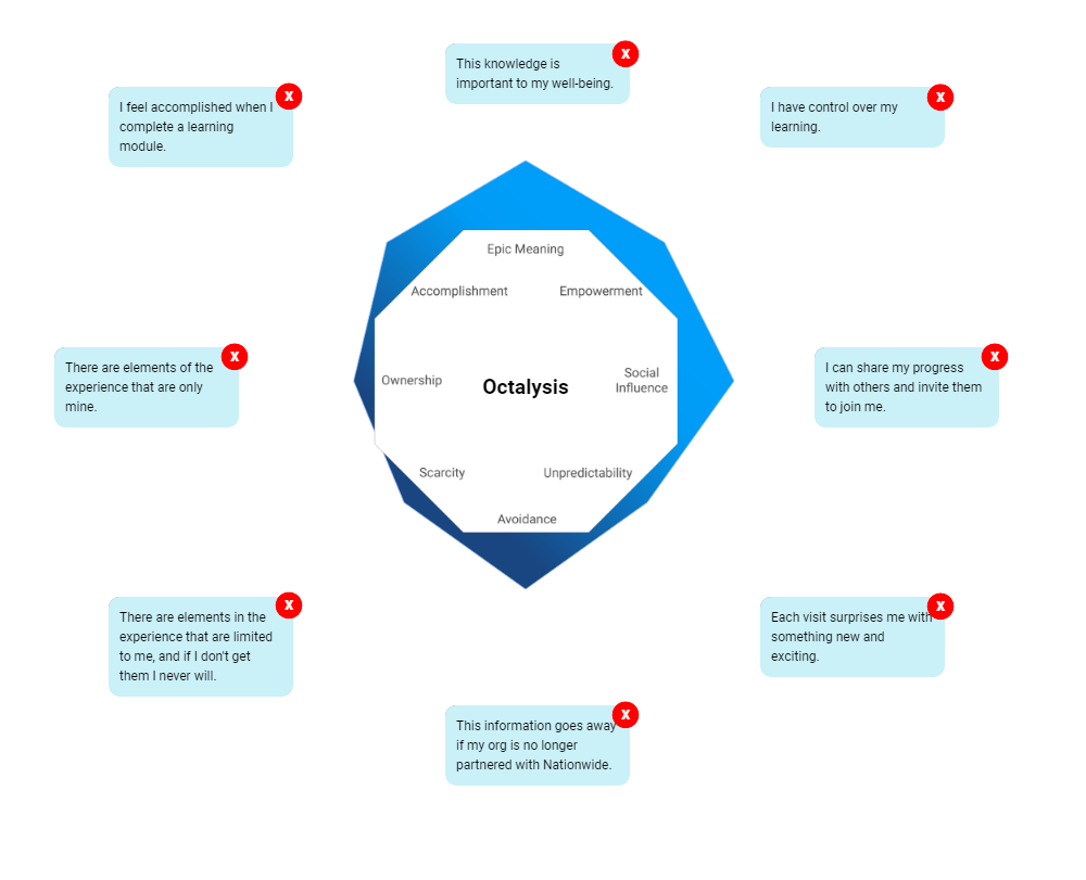
To motivate users to dive into the educational content, we identified key drives that we could leverage in our messaging. Persuasive strategy is mapped using the Octalysis Tool.
- This audience felt nobility for their work, citing that the organization’s mission was not just a business. Thus, they had an appetite for creating the best experiences possible to achieve that mission. Our messaging called out this desire.
- The audience was also very socially connected, so we crafted badges for big accomplishments that users could share within the community to show their progress and mastery of concepts.
Like any ecosystem of humans, because of the connectivity among people and organizations in these markets, there were also micro-influencers in the space that we created personalized messaging for, knowing if we could bring them into the platform, they would bring their audiences.
Challenges & Take Aways
Partners loved this change.
Results
Product + Website
Site Map
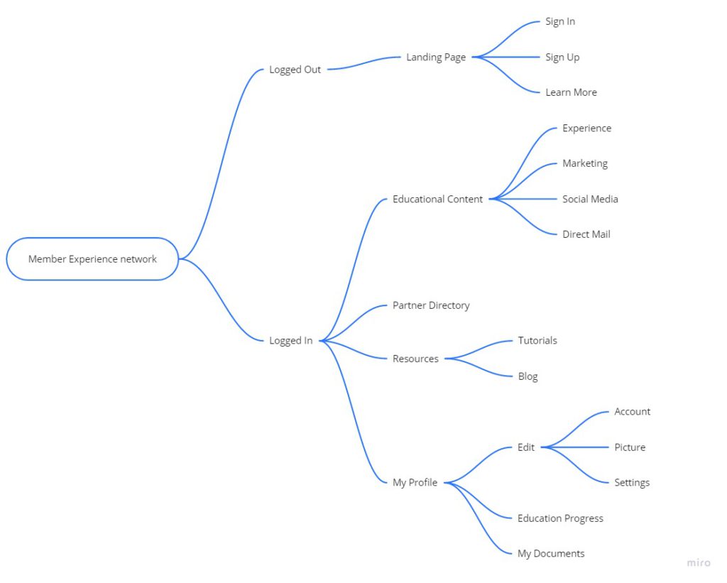
The site itself ended up far bigger than it was originally intended. As we decided to expand into a full-on community platform with a discussion forum, user profiles, progress tracking, and eventually the inclusion of partnership documents and program management workflows, the site grew exponentially more complex. This (recreated unofficial) site map shows the site structure when I left the program.
Onboarding Workflow
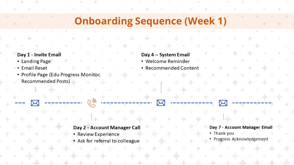
The first week of product deployment was critical to user adoption and speeding program success.
Four key contacts were made with users during launch:
- Invite Email
- Account Manager Call
- System Email
- Account Manager Email
These four touchpoints are proven to be the most likely to drive quick adoption and program growth.
Usage Statistics
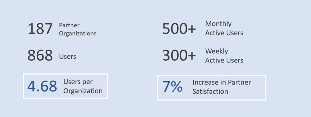
From our 187 partner organizations, we were able to reach:
- 868 total users (4.6 users per organization)
- 500+ monthly active users
- 300+ weekly active users
Most importantly, we also improved our already industry-leading partner satisfaction 7% year-over-year while running the program. Consequently, our partner retention and referral stats were positively impacted as well.
Stats were measured in the CMS and Google Analytics and shared bi-weekly in leadership dashboards.
Marketing & Communications
Newsletters
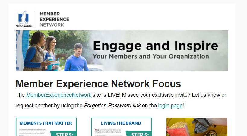
I published a monthly newsletter starting January 2017 through Dec 2018.
I curated all content that went into each edition, including new content from the site, stories from staff, links from other top blogs, and more. Over the life of the newsletter, we maintained impressive results:
- 40% open-rate
- 20% click-through-rate
- 98% deliverability
- 2% unsubscribe-rate
Email lists were integrated between our CRM and Mailchimp.
Site Promotional Video
To launch the site and gain initial traction, I did the voice-over work for and edited this video from new and stock footage. It was featured during live partner events, webinars, and newsletters.
Footage was gathered at a partner event. The video was edited in Adobe Premiere and animations were edited in After Effects.
