The Disney+ Launch Experience is Too Basic for 2020
I, along with about 10 million of my friends, logged in to Disney+ for the first time yesterday. Excited both by the shiny new app, and also by one of the most beloved collections of content ever known to man, I was one of the crazies who opted to pay for 3 years of the service up-front. I love Disney, I love Pixar, I love Star Wars, and National Geographic makes me feel more smarter. Naturally, they had me from the go.
But even after only two days of use, there are some glaring omissions from the app that frustrate me. Since I’m currently in the middle of getting my Master’s in User Experience Design, I felt it appropriate to call out a few things I noticed.

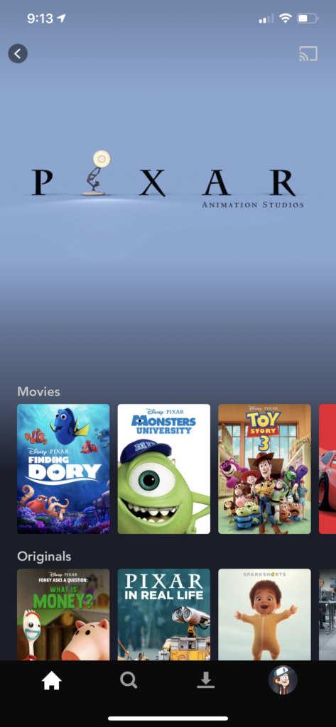
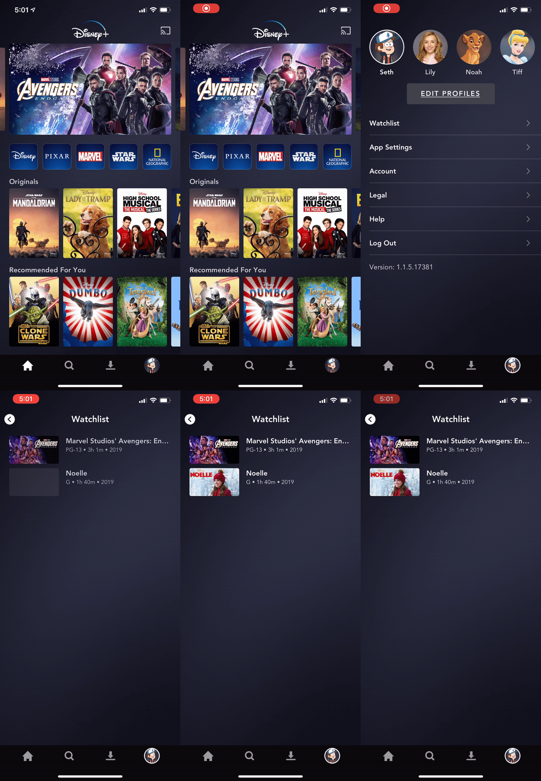
Before I make some subtle jabs at the app, however, I should point to some of the good things it does. As far as design patterns go, Disney was incredibly simple with the interface elements they introduced. A single hero-image carousel for the biggest content “advertisements”, then a single row with 5 live-tiles for each of the major brands that animate as you highlight them. Cute, efficient, and a nice subtle signifier that calls each sub-brand into consciousness. When clicked they take you to the brands sub-menu containing all of the content specific to that property.
The main view has a dark navy/grey background that is barely visibly graded just to add a bit of depth. Very clean and classy. Below the sub-brands are content categories with more titles and thumbnails visible, each row a scrollable swimlane, hinted at by the fragment of another thumbnail along the right edge of the screen. Each row contains 25 titles, but only three are visible (on mobile), to begin with. That means it takes six swipes to view everything in that row, and another six swipes back to the beginning… because there is no quick way to navigate back to the start of the row. The 21 rows of categories coupled with 25 titles per category yield 525 options to choose from the home screen alone. I don’t know how this compares with Netflix, but that number destroys streaming services like HULU in terms of what you can access on a single page. You can get to A LOT of stuff, without having to do much besides swipe up/down/left/right. That’s good.


Going Backwards, Different Ways
But there are design decisions that are unfortunate as well. Given that Disney knew they were going to be building this for years, I would have expected a more fleshed out UI at launch. As far as interaction goes there aren’t a lot of misses, but a simple notable one is the different BACK functionality between content views and brand-specific views.
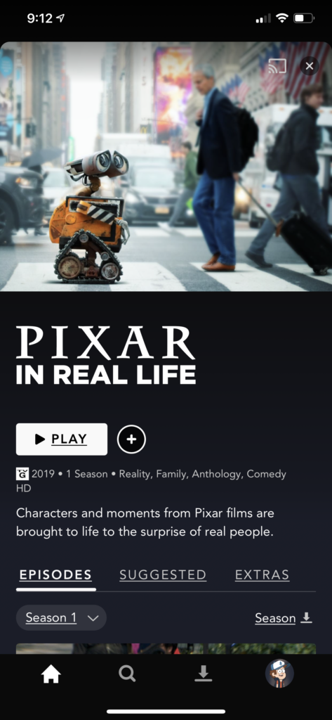
When viewing a piece of content, you can click the X in the upper right to exit or pull down on the view to exit back to the previous page. But when viewing the brand-specific sub-menu, there is a navigation arrow pointing left that takes you back. Maybe it’s done on purpose to help indicate that you’re in that certain type of view, but from a user action standpoint, a single way to go BACK would be preferable.


What Did I Want to Watch Again
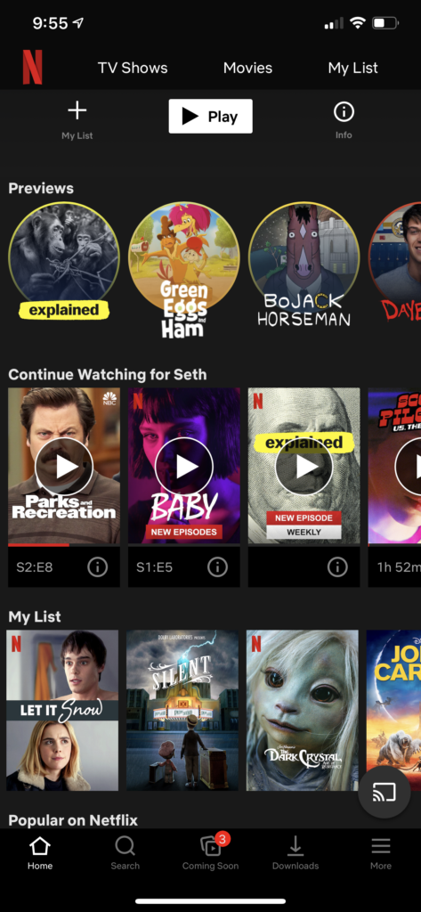
The first two content categories on Netflix are Continue Watching and My List. Neither of those are rows that exist on the Disney+ app. Netflix knows the value of getting back into the show as quickly as possible, and either Disney has yet to learn that (experience with their Disney Now app compels me to say yes) or they are smartly forcing users to go through the catalog over and over for the first few weeks to ensure they get familiar with it. Either way, forcing users to remember what they were watching, and navigate back to it will likely be a frustrating scenario for folks until the app is updated. This is critical for movies and TV shows alike, as time spent getting back to the content is time lost watching the content. Similarly, there is a Watchlist feature in the app, but on large displays, it is hidden in the left-hand menu drawer, and on mobile, it’s awkwardly hidden in the Profile navigation menu with Account Info and Help. Not exactly where you’d go expecting to find a list of content. Odd.
This also brings up the lack of activity history. Potentially to remove things that might eventually influence your recommendations, but even more important for children’s profiles when parents really want to know what their kids have been watching (and how much).

Let’s Get This Sorted Out
The search function is actually pretty useful, limiting the need for filters to a large extent. But one of the best views is “All Movies A-Z” which just lists everything. For a new app like this, with so much old and new content, having a view where you can see everything is so incredibly enjoyable. And yet, the content titles are sorted alphabetically. Period. With no option to sort by release year (maybe I want to see the old stuff), length (maybe I don’t have 3 hours for Endgame), or anything else. I understand the need for simplicity while users build their mental model and understanding of the system, and again, maybe this is early-stage scaffolding by Disney to lead people in the right direction, but… it’s 2019. People are used to media-center like interfaces and have been using them for a decade.
Oh, and speaking of that All Movies view, on mobile it’s only available if you go to the Search view and select Originals, Movies, or Series, and then select the All Movies A-Z category from the filter. No way to get there otherwise.
What’s In An Alphabetically Sorted Name
A final thought about that sorting as well. With a catalog like Disney’s, you end up with multiple Lion King’s, Aladdins, Little Mermaids, Mighty Ducks, and more. The Direct to Home Video productions came fast and furious in the 90s, but the titles of the flicks were all over the place. For example, The Mighty Ducks appears in the M’s as you’d expect, but The Mighty Ducks 2 & 3 (sometimes referred to colloquially as D2 & D3 respectively) are in the D’s. In Disney+, that leads to stories that should be nestled together as part of a collection scattered throughout the hundreds of titles listed, with no assist as to what order they came out in or should be watched in. Playlists that could be added to the Watchlist would be sublime here, especially given the variety of options in which people can watch the entire Star Wars saga these days.

Disney+ did a lot more right than it did wrong. It’s only major issues were those of omission, and knowing Disney they were likely left out with cause. Here’s to looking forward to some updates that add extra functionality in the near future.