For: Kent State UX Masters Program
Role: Student, UX Lead
Spring 2020
Summary
In this academic scenario, I was asked to design a streaming media interface, also known as a 10 Ft Interface. It’s what you would interact with when you navigate apps like Netflix or Hulu. Our client asked for sample views that demonstrated how the interface and remote control would optimize usability.
Skills Used
- Research
- 10 ft. Design
- Sketching
- Wireframing
- Prototyping (Interface)
- Prototyping (Physical)
- Guerilla Testing
- Adobe XD (Repeat Grid…)
Problem
The client, a media company that had only distributed its array of content through web browsers, had identified an opportunity to compete with a physical streaming device for televisions. Because their only previous experience was in media licensing and not over-the-top distribution, they reached out for assistance with this problem.
Approach
This project was a quick turn but still required some up-front research. A resource that I thought would be helpful was a collection of videos on video game accessibility. Since this product was to be displayed on a TV, it made sense to see what advice video games had for improving readability.
With research in hand, I utilized the details from the client to mock-up screens, fields, and rudimentary navigation via hand-drawn sketches. After an initial round of feedback, I moved on to wireframe design and finally to a working prototype of both the interface and the remote control.
Research: 10 Ft. Design Rules
Setting up this design first required looking at the required inputs and expected outputs from the client. In this case, it was clear that images, titles, descriptions, and other video details would need to be displayed in category and featured video view ports. Additionally, the remote control would also need to have only the necessary navigation and media control buttons.
Designs like this also are even more heavily reliant on accessibility rules than other apps. The designs also included considerations for font sizing, colors, opacity, and simplified navigation. Especially helpful was this video from Mark Brown over at Game Makers Toolkit. (8:30 – 8:40)
Viewport Sketches
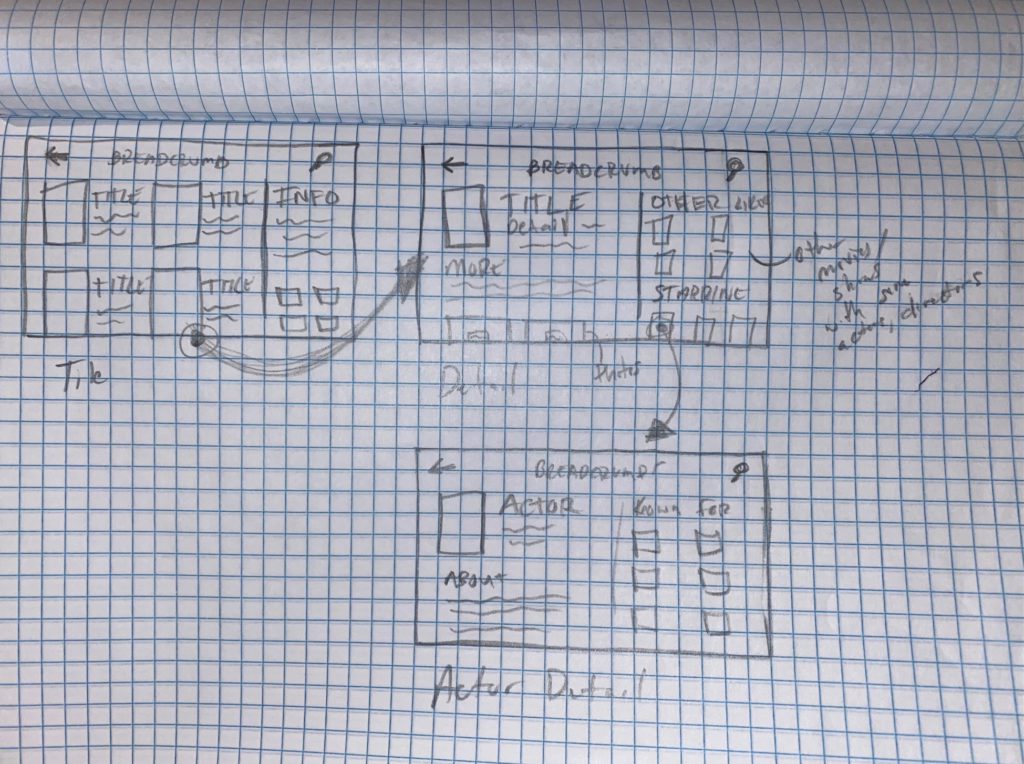
The initial viewport sketches were rough but adequate for moving forward. One thing I learned when researching this kind of work was to start your drawings at as small of a scale as you can handle, which would prevent you from including too much information on the window from the beginning.
I found that these three screens met the deliverable requirements of the client, but did end up adding another viewport for users with vision disabilities.
Remote Sketches
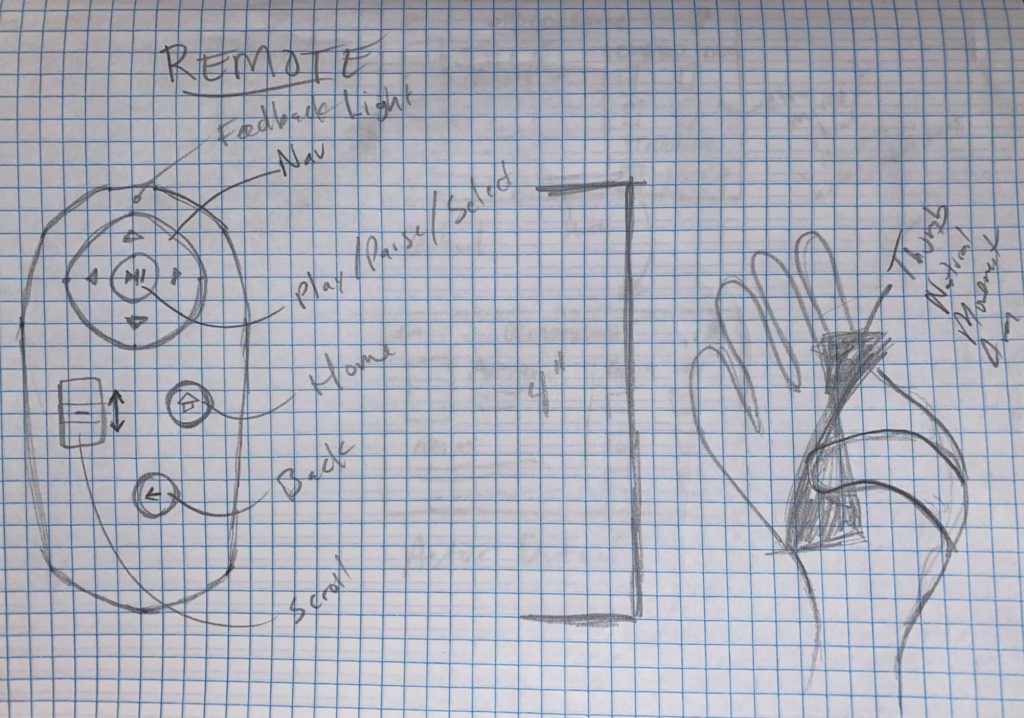
The original remote design was based on existing streaming remotes; single-handed, limited buttons, circle pad navigation, and a central select button.
I also originally imagined users paging through results and included a scroll slider, but later realized that the added functionality didn’t reduce the number of interactions enough to warrant its existence.
Finally, you can see how the final design was influenced by the natural movement of the thumb sketch on the right. The thumb naturally moves in a sort of hourglass pattern, with the most natural movement on the curve from bottom-left to top-right.
Results
This was a fun project and I was pleased with the results. This was one of the project where a lot of the learnings were with the tools themselves, getting used to how XD’s Repeat Grid feature worked, as well as testing different typography styles, sizes, and contrasts.
Viewport Screens
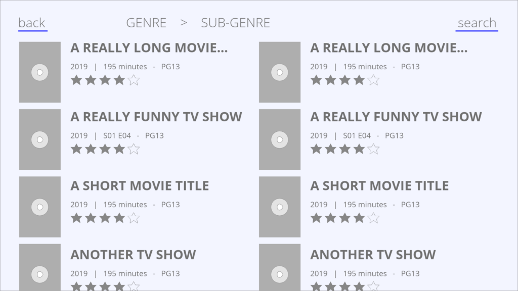
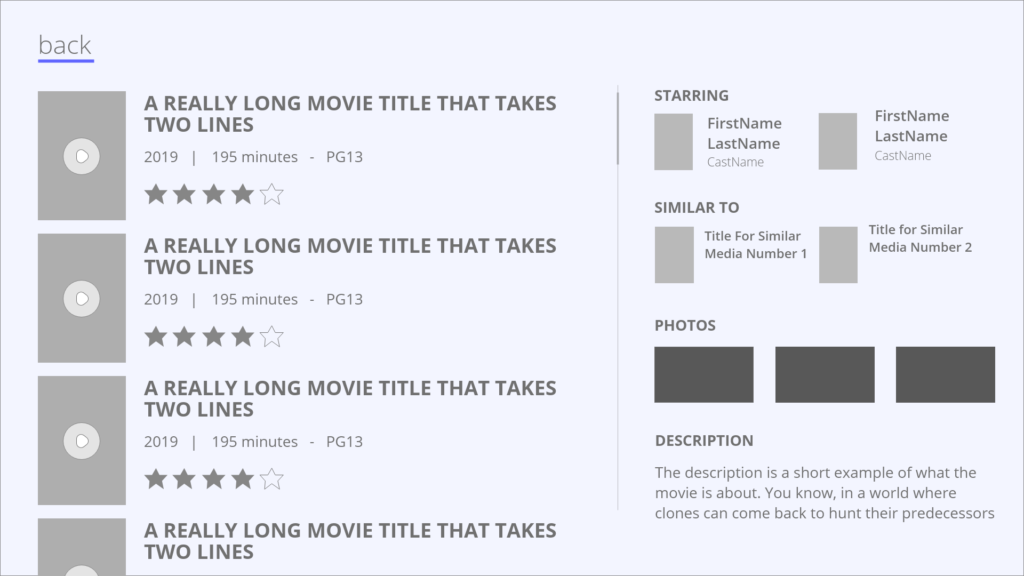
A simple grid view that makes the media title, year-made, runtime, age restrictions, and viewer rating. Also note the bottom row of images is cut off, indicating that there are more options below.
The decision here was to avoid image-only swimlanes used by other apps to allow for more details rather than relying on images only.
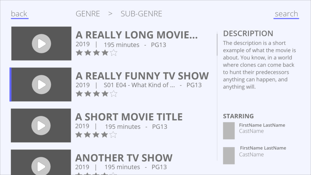
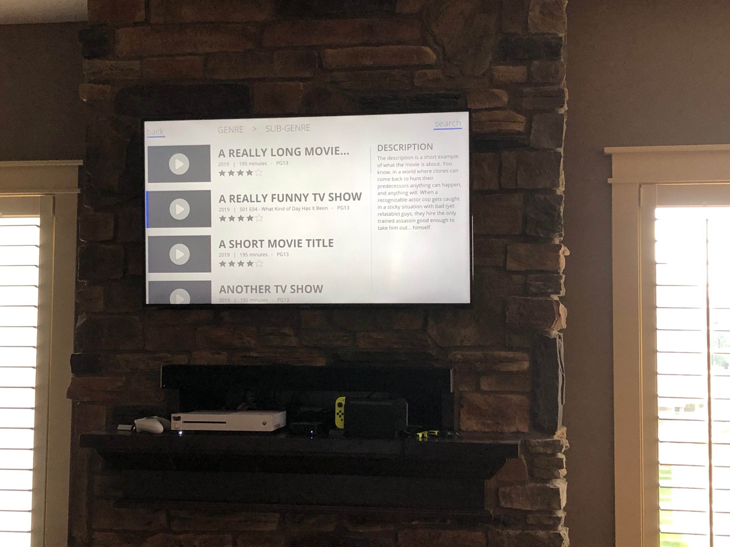
The is an alternate view that allows users to view descriptions and cast information while browsing. This decision was intended to avoid users having to go into media items and then repeatedly backing out. This allows for a single click (up/down) to view more info.
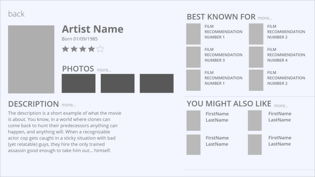
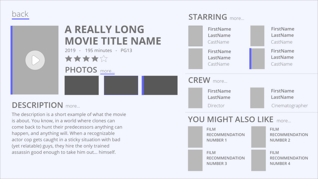
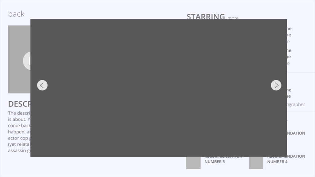
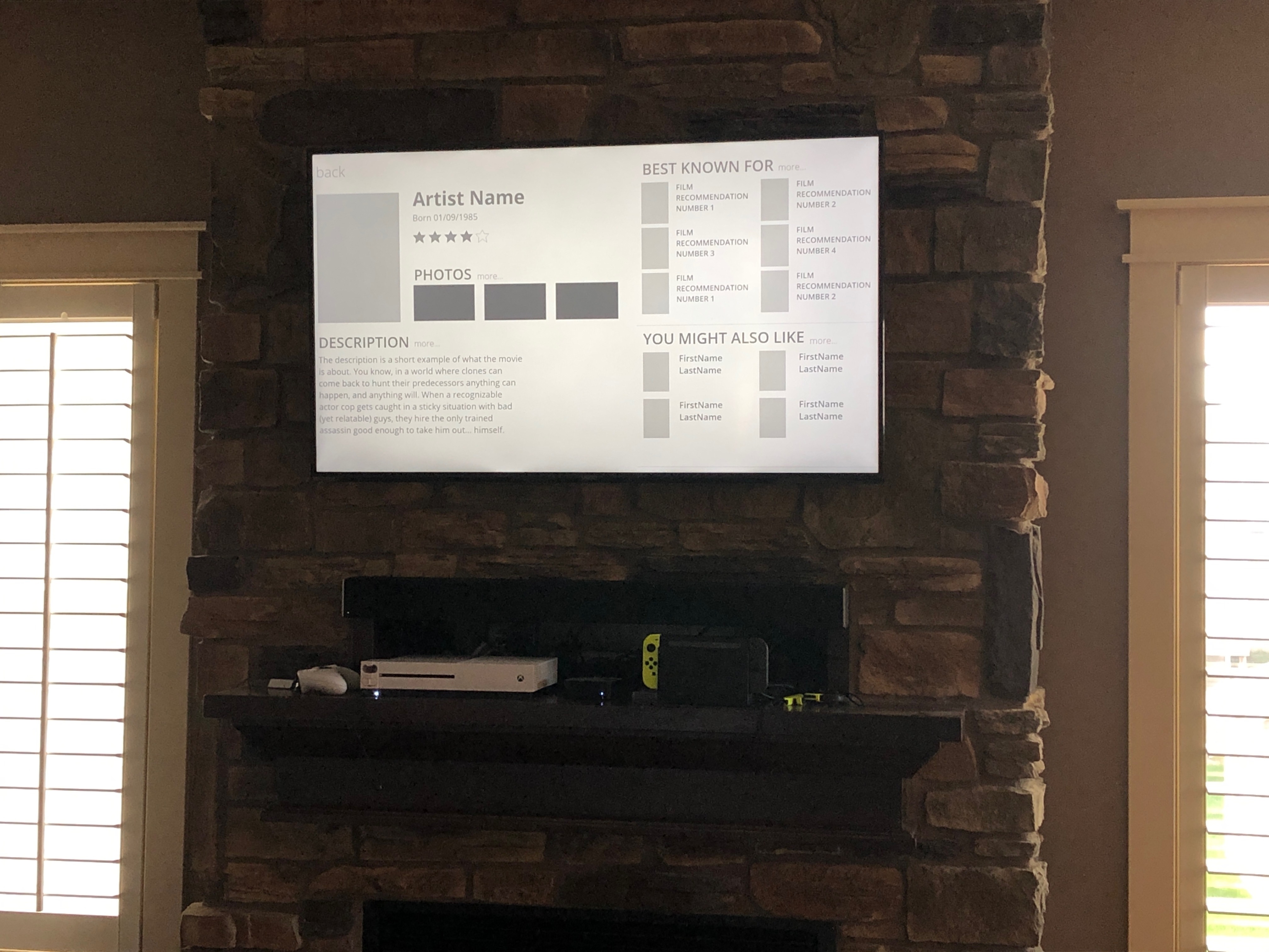
This viewport allows the user to play the media, view photos, or select cast and crew profiles to find similar media. One of the differentiating factors of this app is that its design is intended to assist cinephiles to get deeper into the films they watch, and this viewport helps users do that.
Viewport Prototype
As you can see, this is a very simple prototype, which is appropriate given the medium of this application.
Additionally, it is worth noting the posture of the user, who is likely comfortable in other systems and any deviations from what they are used to would violate Jacob’s Law.
The viewport was tested with a user to determine if the text was legible and if simple tasks were executable. This was not an expectation of the project or client, but I had to know if it “worked”. The participant had success answer all questions and executing all tasks.
Remote Prototype
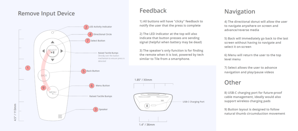
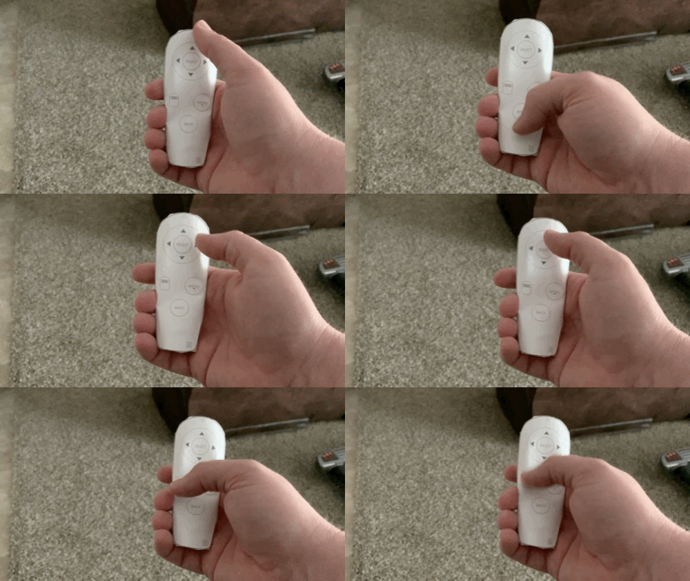
Here you can see the progress from the initial prototype. The first version’s size was good, but the input options were unclear and ergonomically lacking. In the final version, buttons were removed and placed in line with the natural movement of the thumb (red line).
The graphic indicates the final version of the remote, more accurately reflecting the natural movement of the thumb (for right-handed users), while also examining all of the features and controls.
Lessons Learned
- Fonts for 10 ft designs should be no less than 28 pt fonts, as readability degrades quickly below that threshold
- The use of typeface, font size, and case all help distinguish text affordances
- Other affordances are also paramount to usability, helping user distinguish what is selected, what can be selected, and what selection options exist
- A distinct need for long text entries to be handled in a way that is usable and non-distracting
